For my latest graphic design project, I wanted to create a fun Christmas design. I had a pencil sketch of a skull wearing a santa hat, with crossed candy canes, and a bannner across the top that read Merry Christmas. I know the whole skull & crossbones thing has been overdone in the art world, but as have the many variations on the theme, but I love drawing skulls, so I figured I would scan the sketch into PhotoShop and see what I could do with it.
My plan was to use the sketch as simply a rough guide for what I would draw in PhotoShop - the original pencil sketch was done rather hastily on a piece of graph paper.
I started doing line art on various layers above the background layer (the scanned image), making sure to use individual layers for the various elements of the graphic: skull eyes, outline, teeth, santa hat and brim, and candy canes. For the eyes and eyes and cheek bones, I simply drew the left eye and cheek, then duplicated them and flipped them horizontally. This allowed me to have a more symmetrical face.
Once I had all the elements inked, I began coloring. I created fill layers beneath the various inked layers that I wanted to color - white for the skull, black for the eyes, red for the hat, etc.
Next up came the shading and highlights. I found a great tutorial at http://www.gomediazine.com/tutorials/a-pseudo-sugar-skull-from-start-to-finish/ which had an excellent tip for shading. I set up my brush tool in a fashion similar to what was listed in the sugar skull tutorial, with brush size varying depending on what I was working with airbrush mode selected, opacity at about 35%, flow at about 35%, and using either near-black or light grey for color. The best part of using the sugar skull technique is that you can create you shadowing layer above the fill layer, then CTRL + CLICK the thumbnail on the fill layer in the layers palette and air-brush away! Your brush strokes will be constrained to within the area selected by CTRL + CLICKING the fill layer's thumbnail. So if you mess up, or you're not happy with the way it's looking, you can simply hit the delete key and start your shading again.
At one point, I had done considerable shading to the skull, but wanted to add more around the eyes, so I simply created a new shading layer; that way I wouldn't have to start over on the entire skull if I wasn't happy with the shading around the eyes.
At another point, I was shading the fuzzy ball on the Santa hat and realized I didn't have the airbrush mode on. I simply deleted and started over. I also found that I had to experiment quite a bit with brush size. If you use a very large brush size, you will tend to get broader, but more subtle results.
I used highlights sparingly - a little on the Merry Christmas banner text, the Santa hat, and skull forehead. Much of my base color was white, so highlights were not necessary, as the shading resulted in highlights in the negative space created by the shading.
For the skull texture, I used a clipping mask to insert a concrete texture photo that I had taken a while back. I've been building up my own collection of textures to use. I often get funny looks when people see me taking close-up photos or brick walls, sidewalks and ceilings. You can see some of my texture photos at flickr.com. I used linear burn and a similar opacity as the sugar-skull example, and I experimented with a couple different textures to find one that I liked.
Below is the finished design, which is available on t-shirts at Zazzle.com. Happy Holidays!
A blog about Scene Scream t-shirt designs and the process used to create the artwork.
Wednesday, December 8, 2010
Monday, November 29, 2010
World Soccer Shirts
I'm somewhat of an avid soccer fan. I play soccer at least once a week, and follow MSL and the Barclay's Premier League closely. I enjoy getting up early on weekends to catch live matches, especially when West Ham or Birmingham are playing. So lately I've been thinking that I should start designing some soccer-themed shirts. I've been looking for inspiration and trying to come up with soccer designs that fit my tastes as well as the overall asthetic of the store.
One design that I'm quite pleased with is a series of world soccer shirts, featuring a grungy freakshow font and the national flags of various soccer (football) nations in the background. The national flags have been given a distressed or deconstructed treatment to make them a bit gritty. Once I came up with the first design, the US Soccer Shirt, I was able to use that as a template for the rest of the soccer shirts. I've still got more to do, but so far have shirts posted representing many of the prominent soccer countries around the world.
World Soccer Shirts
Labels:
soccer,
soccer shirt,
soccer t-shirt,
world soccer shirt
Wednesday, October 13, 2010
Frankenstein Graphic
Cartoon illustration of a Frankenstein monster with Happy Halloween message.

T-shirts available at:
http://www.zazzle.com/halloween_shirt_frankenstein-235157473518914266?rf=238311127868579309
Check out my other Halloween products:
http://www.zazzle.com/scenescream?rf=238311127868579309

T-shirts available at:
http://www.zazzle.com/halloween_shirt_frankenstein-235157473518914266?rf=238311127868579309
Check out my other Halloween products:
http://www.zazzle.com/scenescream?rf=238311127868579309
Labels:
frankenstein,
halloween,
happy halloween,
monster
Saturday, August 7, 2010
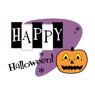
Retro Halloween T-Shirt Graphic
For this t-shirt design, I was inspired by Halloween artwork from the 1950's and 1960's. I wanted to create a Halloween design that incorporated some of what is now 'retro' design elements, such as the boomerang and little sparkly asterisk things, all common in commercial artwork and advertising about 60 years ago. One of the advantages of designing in this style is that I was able to keep things fairly simple. I wasn't concerned with shading and texture, just the overall design of the elements and evoking a retro feel.
The graphic was created entirely in PhotoShop, using a combination of custom shapes, the rectangular marquee tool, and drawing with the pen tool.
The boomerang was actually a custom shape I created for a different design; drawn using the pen tool. The asterisks are custom shapes I downloaded a while back. The pumpkin was drawn for this piece using PhotoShop's pen tool. Each element; the pumpkin outline, stem outline, eyes, nose and mouth; were all drawn on separate layers to allow for flexibility when arranging the face of the jack-o-lantern, and to allow for coloring each element independently. This proved to be very helpful, because at first I wasn't sure what to do with the eyes. Then my wife took one look and suggested coloring them yellow, which would give the effect of the eyes being back-lit by a candle inside the jack-o-lantern. Duh - sometimes I just don't see those things; one of the reasons that drawing and graphic design don't come easy to me.
The coloring was all done in PhotoShop as well. I really like how purple has become part of the Halloween color palette, in addition to traditional black and orange, I chose a rather pale violet color for the purple boomerang, as well as the outlines around the rectangles.
To see the design on a shirt, click here. I also placed it onto a card, as I thought it would make a nice Halloween card.

Friday, July 2, 2010
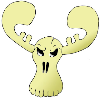
Moose Skull Sktech Colored in PhotoShop
My latest exercise was to take a sketch of a moose skull that I drew a couple weeks ago and scan the line art, then color and shade in PhotoShop. I had the sketch in my sketch pad, drawn and shaded in pencil, then outlined in ink. Based on my last couple of efforts, I had realized that it would be best to scan just the line art, with no shading, in order to have more flexibility once the sketch was digitized.
To start, I carefully erased all the pencil lines and shading before scanning in grayscale at 600 dpi (really ppi), since the drawing was a bit small (about 2 inches high) and I wanted it to be as large as possible. 600dpi is the highest native resolution my scanner supports.
Next, I opened the file in PhotoShop and used the Threshold adjustment to eliminate almost all the background, and make the line art nice and black. After that, I had a bit of initial clean up to do with the eraser tool, and then I zoomed in on the inked lines and cleaned them up a bit using a combination of the paint brush in airbrush mode, and a layer mask. The overall line work in the sketch isn't very good - a bit shaky and not nearly as smooth on the curves as I'd like. I may re-visit it someday and cleanup the lines even more.
Once I was satisfied with the line art, I started creating layers for the coloring as follows:
Eye and nose fill layer
Head fill layer
Antlers fill layer
Shadows layer mask
Highlights layer
I colored the eyes and nose black, then colored the head and antlers. After that I used a layer mask for the shadowing, and played with gradient fills to get some basic shadowing in place, attempting to simulate a light source coming from the upper left of the image. It's not perfect by any means, and is also something I may re-visit at a later date.
The last thing I did was some white highlights in the eyes and nose, to give the illusion of eye and nose sockets. I was going to work on some more highlights for the head and antlers, using a layer mask, but decided to leave the drawing as-is for the meantime.

Thursday, July 1, 2010
Scanned Line Art in PhotoShop
So I've been trying to improve two things in parallel - my pencil drawing and skills in the analog world, and my PhotoShop drawing skills in the digital world. I've done a few drawings in PhotoShop based on either scanning line art and then re-drawing cleaner lines using the Pen Tool, or by drawing from scratch in PhotoShop using the Pen Tool. So far, I've had mixed results, mostly due to the fact that I have a lot to learn and improve upon.
Since I don't have a drawing tablet, when I draw in PhotoShop I'm using the mouse, which presents two obstacles. First, I'm left-handed, but have always used the mouse with my right hand. Trying to do anything with a mouse in my left hand is futile, but when I draw with pencil, I draw left-handed. Second, with the mouse I don't get the natural pencil stroke effect, so all my lines are pretty boring, unless I use various brushes to shape them.
What I've really been after is a good way to scan in my drawings and then use the original line art in PhotoShop, and last night I discovered a way to do this. After browsing quite a few tutorials on separating line art to its own layer, I was able to piece together a technique that got me decent results. The line art was just a simple skull that I drew a few weeks ago, and not a very good drawing at all, but it served the purpose of working through a tutorial and getting fairly clean line art onto its own layer, which could then be colored.
First, I used Levels to blow out the background and darken the lines. Then I loaded the alpha channel as a selection and inverted, so that I had just the lines selected. Then I copied the layer to a new layer and filled the line art with black. After deleting the original layer, I now had the line art on a transparent layer, and could create new layers underneath for coloring.
I also learned that you can lock the transparency on the line art layer, which enables you to color the actual line art while preserving the overall integrity of the lines. However, I was happy to keep my lines black. I spent a few hours playing with this and coloring two sketches, and was quite excited to be able to do this.
I need to refine the process of cleaning up the line art - one of my drawings was scanned from a sketch pad, and the paper texture was difficult to remove from the background. Also, I realized that for scanning purposes, I should not shade my sketches before scanning. I still need to learn more about shading and I'm thinking I should draw, scan, then shade and scan again, or else learn how to shade in PhotoShop.
Overall, this is an encouraging step in my learning process, and is motivating me to continue with pencil drawings, improving my line work, and also using ink to draw over pencil to get better lines for scanning.
Here is the first sketch I practiced on. I cleaned up a lot of stray pixels, but you can see some remnants of smudging in the mouth. Also, the lines aren't very clean. But I was more interested in the process of separating the line art and then coloring it:
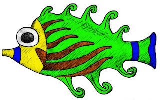
Here is the second drawing I practiced on. This one is a drawing of a fish statuette that was in a hotel room I recently occupied. The coloring took much longer on this one, but was fun to do. And I was actually surprised at how much better it looked once it was colored. Still, there are sloppy lines and remnants of the paper texture in the background around the outside edges of the drawing. This was originally drawn in pencil, then the lines re-drawn in black ink.
A technique I used for identifying stray pixels, smudges, places where I colored outside the lines - I created a background of a contrasting color - in this case red - which helped me see my mistakes much more easily. I used a combination of the eraser tool and layer masks to clean up the coloring:
Tuesday, June 15, 2010
Latest Design Theme - Moai Tiki Skulls
For a while now, I've had a somewhat passive interest in tiki art and tiki culture. I love the retro-kitsch aesthetic of those old Polynesian-style restaurants, and places like Caliente Tropics Resort in Palm Springs. We also have some tiki masks that a friend imports from Indonesia, as well as a couple small pieces of tiki-style art around the house, including a decoupage piece that my wife made a few years ago.
As I pursue my informal education in drawing and sketching, I find myself drawing lots of skulls, and in the quest to create something a bit different, I started working on a mash-up of sorts - designing a tiki-tyle skull, modeled after the Moai or Easter Island style tikis - the ones with the furrowed brow and the large nose.
My two latest designs incorporate the tiki skull in two variations. Below are links to the t-shirts in my Zazzle store:

http://www.zazzle.com/lady_tiki_moai_skull_shirt-235985898826600676?rf=238311127868579309
http://www.zazzle.com/tiki_skull_with_flames_shirt-235647319650225983?rf=238311127868579309
To start, I drew the elements of the skulls on paper, then scanned into Photoshop and traced using the pen tool. This helped me get cleaner lines and better symmetry. For the eyes, nose and teeth, I used tracing paper to trace the skull outline, then drew lots of variations of each element overlayed on top of the skulls, until I had ones I was happy with.
The flames were done using a custom shape, which I then colored in PhotoShop using gradients. Then I cut individual pieces of flame out of the original drawing and place them behind the skull.
The tiki pattern in the background was first sketched in pencil, then drawn from scratch in PhotoShop using the pen tool. I then converted each element to a custom shape so I could save for future use. I pasted the shapes into a new document and arranged to form the background. The pink flower behind the lady tiki skull's 'ear' is one of those shapes.
As I pursue my informal education in drawing and sketching, I find myself drawing lots of skulls, and in the quest to create something a bit different, I started working on a mash-up of sorts - designing a tiki-tyle skull, modeled after the Moai or Easter Island style tikis - the ones with the furrowed brow and the large nose.
My two latest designs incorporate the tiki skull in two variations. Below are links to the t-shirts in my Zazzle store:

http://www.zazzle.com/lady_tiki_moai_skull_shirt-235985898826600676?rf=238311127868579309
http://www.zazzle.com/tiki_skull_with_flames_shirt-235647319650225983?rf=238311127868579309
To start, I drew the elements of the skulls on paper, then scanned into Photoshop and traced using the pen tool. This helped me get cleaner lines and better symmetry. For the eyes, nose and teeth, I used tracing paper to trace the skull outline, then drew lots of variations of each element overlayed on top of the skulls, until I had ones I was happy with.
The flames were done using a custom shape, which I then colored in PhotoShop using gradients. Then I cut individual pieces of flame out of the original drawing and place them behind the skull.
The tiki pattern in the background was first sketched in pencil, then drawn from scratch in PhotoShop using the pen tool. I then converted each element to a custom shape so I could save for future use. I pasted the shapes into a new document and arranged to form the background. The pink flower behind the lady tiki skull's 'ear' is one of those shapes.
Monday, June 14, 2010
Greetings
Welcome to the Scene Scream graphics blog. I came up with the name Scene Scream because I wanted to create t-shirts based on the different music and subculture scenes that have influenced my life, such as skateboarding, ska and punk music, and vintage scooters. A couple of months ago I got to work on a few simple t-shirt designs and started posting them at http://www.zazzle.com/scenescream. So far I've got about a dozen different graphics designs up on various products, such as t-shirts, skateboard decks, mousepads, note cards and hats.
A little about myself - I'm a total amateur when it comes to the visual arts. I have briefly tried my hand at acrylic painting, and have no formal training in art, with the exception of music. I've always wished I could draw with some level of competency, and when I look at drawings, especially pencil sketches, I am amazed at what people can come up with using graphite. It all seemed to magical to me, and still does, but since I began reading about drawing with pencil, purchased some inexpensive drawing pencils, erasers and paper, and started practicing daily, I'm beginning to desconstruct the process and gain valuable insights into the fundamentals of drawing and sketching.
I'm finding that this whole t-shirt design thing runs along two parallel paths; one dealing mostly with the artistic part, which forks off again into "art for pleasure" and "art for business"; and then the marketing/promotion/business path.
Of course, the more involved I get in creating the graphics, the more work I'm realizing needs to be done to 1) improve my graphic design and artistic skills and 2)promote the heck out of this if I ever want to see real sales come in. So far I have managed to sell one t-shirt, so I think there is potential, since I've read testimonials from people saying that it took them much longer to make their first sale.
Still, there is a long road ahead, and it's one I look forward to traveling. Since launching this endeavor I've started taking online drawing classes, immersed myself in advanced PhotoShop tutorials, and already I'm seeing progress in my overall abilities. I've never been very good at visual arts, especially drawing, but I started going through the beginning tutorials at http://www.drawspace.com, and already I'm beginning to 'see' more like an artist, and getting some drawings that are at least decent enough to scan and then re-draw in PhotoShop. For anyone who wants to get started with drawing, I highly recommend the site. And do yourself a big favor- start from the very beginning. It will pay quick dividends if you start from the very first lesson and work your way through. Within days you will see your progress accelerate and you will be surprised at how good your drawings turn out. This will quickly spill into the other facets of your artistic endeavors.
In the course of my online explorations into the world of visual arts and graphic design, I've seen a lot of cool blog sites posted by real artists who share insights into their world and creative process. That inspired me to start this blog; not only to 'promote' my artistic efforts, but to hopefully share some of what I have learned, and offer some hope to others are interested in art, drawing and design.
Subscribe to:
Comments (Atom)


